
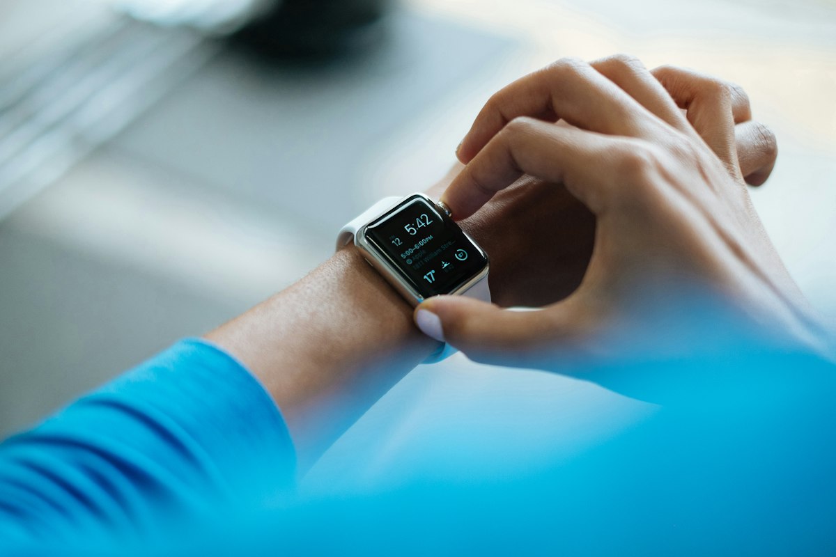
Building Aviator Pilot Watch forced us to answer a question we hadn’t fully confronted before: what does it mean to design for a screen that someone glances at for 1.5 seconds while managing a checklist at 8,000 feet?
The answer turned out to be less about aesthetics and more about a kind of merciless prioritization.
The Glance Contract
Every watchOS app implicitly makes a contract with the user: I will give you what you need in one glance. Break that contract and you’ve failed, regardless of how good the rest of the experience is.
For pilots, the stakes make this contract explicit. Cockpit instruments are designed around the principle that any element competing for attention is a liability. A watch face that requires scanning — that makes the eye search for the number it needs — is a watch face that doesn’t belong in that environment.
We started Aviator Pilot Watch with a list of every piece of information a pilot might want from a wrist-mounted display. It was a long list. The design process was almost entirely subtraction.
Contrast Over Color
Color in watchOS apps is tempting. It’s an easy way to differentiate, to brand, to signal importance. But in variable light conditions — bright sun, cockpit shadows, night operations with red lighting — color reliability drops.
We chose to rely primarily on contrast ratios and positioning rather than color coding. The most critical figure on any screen is the largest. Supporting data is visually subordinate. Nothing is decorative.
This constraint, which felt limiting at first, turned out to produce a cleaner result than any color scheme we prototyped.
Complications as the Real Product
For many watchOS apps, complications are an afterthought — a small icon that opens the app. For Aviator Pilot Watch, complications are the primary interface. Most of what a pilot needs from the app, they need without opening it.
We spent more time designing the complications than the full-screen app views. The right complication in the right watch face slot is the product. The full app is the configuration tool.
This inversion — complications first, app second — is something we now apply to any watchOS product we build. It asks better questions from the start: what does the user need to see without any friction at all?
What We Took Away
Building for a demanding, safety-conscious user group clarified our thinking about Apple Watch design in general. The constraints that make sense for pilots — glanceability, contrast, complication-first design — make sense for any user who has something more important to do than look at their watch.
The best watchOS apps disappear into the background of a person’s day. They surface exactly the right information, at the right moment, with zero friction. That’s the standard we build to.